How to Match a Watch Strap to the Dial Color and Design Elements
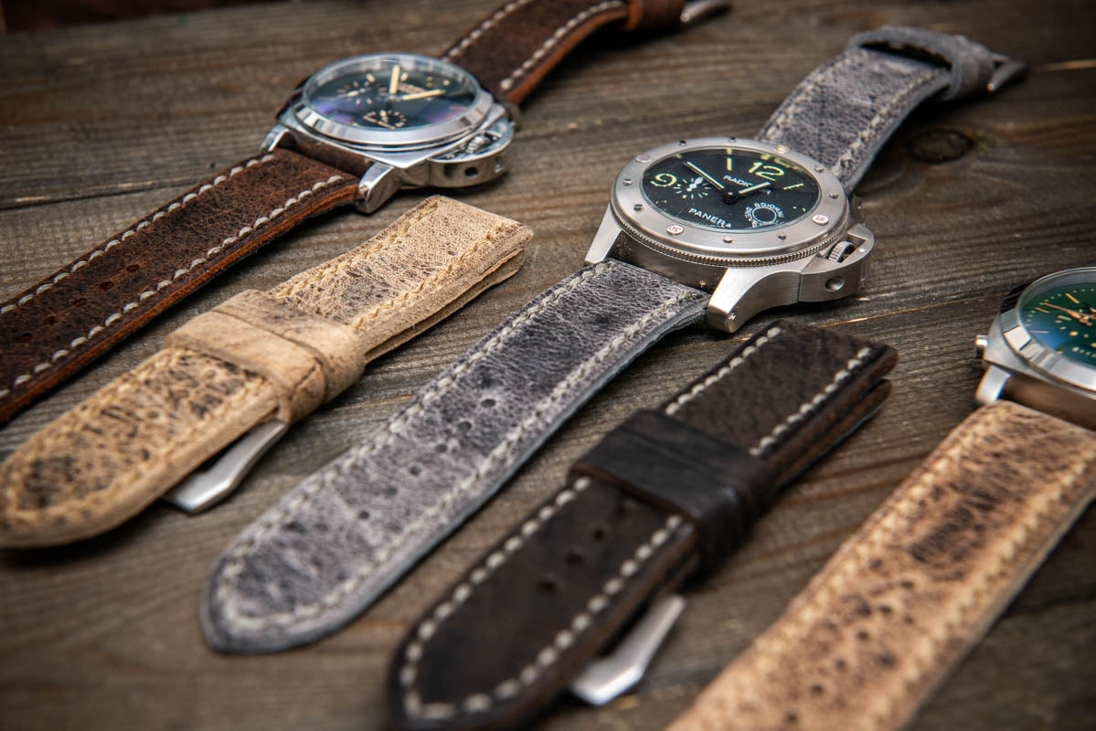
Choosing the perfect watch strap is an art - a balance of craftsmanship, aesthetics, and self-expression.
At FinWatchStraps, we see strap selection not merely as an accessory choice, but as a way to emphasize the character of your watch - and the personality behind it.
A well-chosen strap can completely transform a timepiece: a bold contrast can make it stand out, while subtle harmony can make it feel effortlessly refined. The color, texture, and finish of the strap work together to define the overall impression your watch creates.
1. Color as a Design Element
A strap’s color is never secondary. It defines the mood, enhances proportions, and determines the emotional tone of your watch.
At FinWatchStraps, we often witness how a single case takes on a completely new character just by changing the strap: sharp lines soften, sporty cases gain elegance, and minimalist dials acquire depth.
To choose the right color combination, you need to understand the basic principles of color theory.
2. Fundamentals of Color Harmony
When matching a strap to your watch, three main approaches can help achieve visual balance:
Complementary Colors
These are opposite each other on the color wheel - dynamic and expressive.
- Blue dial → brown or orange strap
- Black dial → burgundy or oxblood strap
- White dial → deep green strap
Perfect for those who want their watch to make a statement.
Analogous Colors
Found next to each other on the color wheel, these create smooth, natural harmony.
- Blue dial → teal or navy strap
- Brown dial → red-brown strap
- Green dial → olive strap
This approach works beautifully for business or everyday wear - calm, cohesive, and timeless.
Monochromatic Combinations
Different shades of the same color produce subtle sophistication.
- Black dial → matte black or charcoal strap
- Blue dial → layered tones of blue
- Grey dial → silver-grey strap
Monochromatic styling emphasizes simplicity, precision, and elegance.
3. Matching the Strap to the Dial Color
Below is a concise guide based on observations from FinWatchStraps artisans
Black Dial
The most versatile base for creative combinations.
- Classic: smooth black leather - ideal for formal occasions
- Bold: red, yellow, or burgundy straps - sporty edge
- Refined: grey or anthracite - minimalist balance
- Natural: olive, khaki, or dark brown - relaxed, earthy tone
Blue Dial
A long-time favorite among collectors and enthusiasts.
- Warm contrasts: brown, tan, or cognac leather
- Harmonious: deep navy rubber or leather strap
- Sophisticated: navy strap with matching stitching
White / Silver Dial
Light dials demand careful contrast management.
- Classic: black leather strap
- Balanced: dark blue or graphite tones
- Warm and modern: tan or camel leather
- Contemporary: grey or green suede straps
Green Dial
One of the most popular modern trends.
- Natural: brown, tan, or chestnut leather
- Military-inspired: olive, khaki, or canvas
- Vibrant contrast: orange or burgundy details
- Understated: grey nubuck or taupe tones
4. Coordination with Design Elements
Hands and Indices
Professional coordination goes beyond the dial color:
- Match the stitching color to the hands or indices.
- Use strap lining to echo a subtle color from the dial.
- If contrast feels too strong - tone it down by keeping stitching in the same color as the leather.
These small choices create a sense of deliberate design and visual unity.
Case Material
Gold Cases
- Classic warmth: brown and cognac shades
- Elegant contrast: navy or black straps
- Deep character: burgundy or chocolate tones
Stainless Steel Cases
- Works best with cool colors
- Blue, green, and grey enhance the metallic surface
- Tan or chestnut leather offers a strong, warm contrast
Titanium Cases
- Best paired with natural, muted tones
- Anthracite, stone grey, and olive highlight titanium’s texture
- Avoid overly bright colors - they can break the aesthetic balance
5. The Psychology of Color
Color speaks directly to emotion. At FinWatchStraps, we often notice how strap color reflects the wearer’s mindset and personality.
Black Straps
Symbolize confidence, structure, and timeless elegance - chosen by those who appreciate discipline and order.
Brown Straps
Warmth and reliability. Preferred by people who value authenticity, practicality, and craftsmanship.
Blue Straps
Associated with calmness, intelligence, and composure - ideal for professionals and detail-oriented individuals.
Green Straps
Evokes balance and connection to nature - chosen by those who appreciate harmony and grounded aesthetics.
Bright Colors (orange, red, yellow)
Express individuality, energy, and creativity - perfect for those who treat watches as a form of self-expression.
Neutral Tones (grey, beige, taupe)
Discreet sophistication. Chosen by those who seek subtlety, quality, and refined understatement.
6. Seasonal Recommendations
Spring & Summer
Lighter months call for breathable materials and fresh colors.
- Pastels: sky blue, mint, soft pink
- Light leather or suede for comfort
- Rubber for practicality and versatility
Autumn & Winter
Cooler months pair best with rich, textured tones.
- Deep brown, burgundy, dark grey
- Suede or grained leather adds warmth and depth
- Olive or khaki straps for a natural, grounded look
7. Matching the Strap to Style and Occasion
Formal Watches
- Color palette: black, dark brown, navy
- Material: smooth leather, alligator
- Principle: the strap should complement, not dominate.
Everyday Wear
- Experiment with contrast stitching, suede, or textured leather.
- A strap should express personality but remain versatile.
- Seasonal rotation keeps your watch fresh and adaptive.
Sports Watches
- Materials: FKM rubber, sailcloth, high-strength synthetics.
- Colors: bright contrasts, orange, red, or camouflage.
- Focus on durability and comfort — the strap should perform as well as it looks.
8. Practical Tips
- Mind proportions. Too wide a strap can overpower the case; too narrow can make it look fragile.
- Check colors under natural light. Artificial light can distort tone perception.
- Consider context. A bright strap might look great on vacation, but not in a boardroom.
- Avoid over-matching. Slight variations in tone create depth and authenticity.
- Use quick-release spring bars. They make swapping straps fast and easy.
- Build a capsule strap collection. Two neutrals + one accent = endless combinations.
9. Common Mistakes
- Ignoring proportions between strap and wrist size.
- Choosing a strap color without considering the case or dial details.
- Over-matching - identical tones can feel dull.
- Mixing inappropriate materials (shiny patent on a field watch, for example).
- Neglecting craftsmanship - poor-quality leather ruins even the best color choice.
10. Final Thoughts
Matching a strap to your watch is not about strict rules - it’s about harmony and intuition.
At FinWatchStraps, we believe that a strap is not just a functional part but a storytelling element - an extension of both the timepiece and its wearer. When color, texture, and proportion come together, the watch transforms - sometimes subtly, sometimes dramatically - but always personally.
Remember: one high-quality watch case and a few well-chosen straps can create an entire wardrobe of looks. With thoughtful color coordination, your watch becomes more than an instrument of time - it becomes a reflection of you.


